Thursday, May 19, 2011

Week 7 Lab

Here is my lab for Week 7:

The area selected is a portion of the Santa Monica Mountain range as it ends and hits the Los Angeles basin. The extent of the map is 34.339 on the top, -119.171 on the right, 34.274 on the bottom, and -119.233 on the left. The geographic coordinate system used is GCS_North_American_1983.


-Nick

Thursday, May 12, 2011

Week 6 Lab

Here is my lab for week 6.


This map projection assignment was extremely interesting to do and I actually thoroughly enjoyed it. Looking at different maps I always wondered where they came from and how the projection was set up. Obviously before this computer technology it was a lot more difficult, but now the accessability of these projections to the public is amazing. What I also thought back to was how this technology could be tied in with something like Google My Maps. Now map projections with pictures and labels of places doesn't seem so daunting and difficult, I would even enjoy making projections on my own and printing them since I enjoy maps so much.

First set of projections are the equal area maps which seem to conform to more traditional standards of what a map looks like to us. For the cylindrical projection, as you move further from the equator, the map gets distorted so area at the poles shows up very small. So this kind of projection would definitely be best if you wanted to focus on land or area near the equator. This is in slight contrast to the mollewide equal area projection, which tends to maintain a better area projection of the poles. This map projection is also in a curved form though, which makes for a very different view already. What is most interesting is that although these maps are both equal area, they show an estimated 2,200 mile difference between the distance between Washington D.C. and Kabul. So this map projection might not be best for that, because of the great variety.

The next set of projections are the equidistant ones, with azimuthal equidistant being first. This projection I selected also is centered on the North Pole as opposed to the intersection of the Prime Meridian and Equator. As was said earlier in class, this kind of map projection would be ideal to measure distance from a center point to see range. Whether it be how far can your plane fly or how far a missile can be launched from a single point. The cylindrical equidistant too maintains equal distances between land masses, so this is very good at putting distance from two points in perspective. Yet despite their same projection, there is once again about a 2,000 mile difference for both maps between Washington D.C. and Kabul.

For the next set of projections, the conformal maps, they preserve angle between two points, but often at the cost of accuracy of size and shape of big land forms. Also, because the angle is maintained, the polar areas grow to be incredibly large and overblown in size compared to the rest of the world. The mercator conformal is ideal for navigation precisely because it maintains angles from one point to another and still can show an accurate representation of land near the equator. Stereographic conformal projection centered on the south pole, is probably the most interesting of all the projections I made. First, we hardly ever view the world from the southern pole and second, the areas of land masses become so distorted that only a section of the United States shown is larger than the entire southern hemisphere. Also the distance between Washington D.C. and Kabul is most altered, measuring at just over 30,000 miles between the two, which is most definitely not the most direct route. Once again though, a really intriguing projection.

Thursday, May 5, 2011

Lab 4: GIS Intro

Below is my map image for the Lab 4


As you may notice from looking at it, this is not a completed Lab whatsoever. And as much as I would like to have a valid excuse for why this is not completed I don't have one worth writing on here. I can say this though, my experience with this program has been so difficult and convoluted that completing this project was a major problem.

We can start with the great things of this program and the benefits of ARCGIS, mainly being the ability to transpose layers on one another, add data that can be visually expressed, and organize a map in a variety of scales and land use types to really help understand a problem or solution. Already I found it absolutely fascinating that by adding in data from sources provided that it can all come together in this problem and show some remarkable images for better understanding of an issue.

With that said, this program also has many problems and flaws to it. First is that it is complicated in all the wrong areas and simplified where more detail is needed. Specifically, the userface is that of a Windows 98, which surprises me considering we are now in 2011. I would imagine there are much more user friendly ways to make such a comprehensive map. Also, as you transport to each level of mapping you can easily mess up past information without meaning to.

Another problem is that if you have to save data from one project session to another, it doesn't always save the data. Input data is lost often in the transfer which means you have to double back and refigure out where you went wrong.

Finally the method of instruction for this was based solely off of the tutorial. I can follow instructions, but to really gain insight into the program and how to make it work, there needs to be more practical teaching in Lab as a whole.

-Nick Rojas

Thursday, April 14, 2011

Lab #3 My Map of Singapore

Here is my map of things to see in Singapore.


View Seeing Singapore in a larger map


There are many great things about a map like this. It allows you to look down over an area and not only see where things are, but read a little about them and see what the physically look like through pictures. I know for me if someone were to describe a "merlion" statue I would be very confused by what I was trying to imagine. A picture that supplements the description really helps. Also a video, like the only for the Vertical Mile, allows viewers to not only see the event, but grab a glimpse of the city as well as if you were standing at the top of the building.

There are some limits though that come with a map like this. Obviously you are not physically there, so it can't replace seeing a site in person. Also you must need internet access in order to see this. You can't interact and open up descriptions if you print this to take with you. Finally, the map is just that, a map. It is whatever someone wants it to be. No matter how well designed, its up to the user to make the most of it.

-Nick Rojas

Thursday, April 7, 2011

Lab #2

Here is my lab #2


 1. Beverly Hills Quadrangle
2. Canoga Park, Van Nuys, Burbank, Topanga, Hollywood, Ocean, Venice, Inglewood
3. 1966
4. NAD 27 & NAD 29
5. 1:24,000
6. At the above scale, answer the following:
a) 1200 meters
b) 1.89 miles
c) 2.64 inches
d) 12.5 centimeters
7. 20 feet
8. What are the approximate geographic coordinates in both degrees/minutes/seconds and decimal degrees of:
a) 34°4’22” N or 34.075°N & 118°26’20” W or 118.439° W
b) 34°00’25” N or 34.007°N & 118°29’48” W or 118.497° W
c) 34°7’05” N or 34.118°N & 118°24’35” W or 118.409° W
9. What is the approximate elevation in both feet and meters of:
a) 560 feet or 151 meters
b) 140 feet or 43 meters
c) 700 feet or 213 meters
10. Zone 11
11. 3763Northing & 361.5 Easting
12. 10,000 square meters
13. See attached Chart
14. +14° Magnetic Declination
15. Flows Southward
16. See attached image


Thursday, March 31, 2011

Lab 1 Post

For my first lab submission, I have three extremely interesting maps that all deal with major issues we as a people are facing in the nation and throughout the world.

First is a map displaying the proximity of any area to the nearest McDonalds. Light colored areas show a McDonalds that is present, while dark areas represent an area without one.

http://www.geekologie.com/2009/09/28/McWhatthehell.jpg

This image was gathered by Stephen Von Worley, who is an artist who gathered the data of the over 13,000 McDonalds in the Contiguous United States and then mapped it out for an art project. What we are greeted by as an audience is an alarming although not surprising image of a country illuminated with the color of one fast food giant. If you were to look at a night time photograph of the US, it would look quite similar with McDonalds being densely populated in areas that are densely populated by people. What does this say about us as a people? For this is only one chain of fast food restaurants that has aided in turning us into one of the most obese countries in the world. It is a public health crisis, and it's easy to see why with such a large amount of unhealthy food available.


The second map posted is one displaying the average wind speeds of regions throughout the world. 
http://news.cnet.com/i/bto/20080304/3t_global_wind_540x420.jpg
3Tier which is a renewable energy assessment company created this map for a conference in Washington back in 2008 to take a look at the viability of wind as an energy source around the world. As shown with the diagram, darker to lighter colors over bodies of water indicate increasing mean speed and on land as the color progresses from purple to green to red the mean wind speed increases as well. As the major question of sustainable and renewable energy comes into play and where we can get it, maps like these are becoming increasingly important to study. The map shows that over 40% of the earth has average wind speeds over 6m/s, but most of these areas are under developed. It will be a challenge for these countries to develop the area for energy use or not, but at least the option is there.


Finally, is an image of the flight paths of all the planes that fly over the United States, Mexico, and Canada in just one 24 hour cycle.

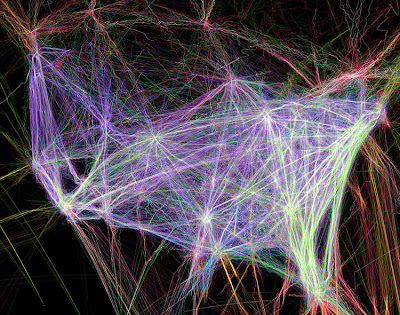
http://consci.s3.amazonaws.com//wp-content/uploads/usa-flightpaths750.jpg

This image courtesy of Contrail Science which studies contrails and chemtrails that are emitted from aircraft and other machinery. In this constantly growing world that we live in, people are traveling more and more not just from country to country, but within the same nation as well. There is no better example of this then the United States, where thousands of flights light up this map with their flight path. More streaks of color or brighter amounts of it in an area indicate another flight that went through that area. The East Coast of the Untied State is the most busy, with Atlanta, Georgia being the busiest airport in America. This map helps remind us how much we take flight for granted. Just 100 years ago it was a novelty for only the brave or rich, now it is an extremely practice of all people that happens daily. Also, we often worry a great deal about the risks of flying as a public, but considering how many flights occur each day and how few have problems, it really is an incredibly safe although expensive way to travel.


All three of these maps portray an extremely interesting and dynamic view of the world regarding products, the climate, and practices that define this planet.