First is a map displaying the proximity of any area to the nearest McDonalds. Light colored areas show a McDonalds that is present, while dark areas represent an area without one.
 |
| http://www.geekologie.com/2009/09/28/McWhatthehell.jpg |
This image was gathered by Stephen Von Worley, who is an artist who gathered the data of the over 13,000 McDonalds in the Contiguous United States and then mapped it out for an art project. What we are greeted by as an audience is an alarming although not surprising image of a country illuminated with the color of one fast food giant. If you were to look at a night time photograph of the US, it would look quite similar with McDonalds being densely populated in areas that are densely populated by people. What does this say about us as a people? For this is only one chain of fast food restaurants that has aided in turning us into one of the most obese countries in the world. It is a public health crisis, and it's easy to see why with such a large amount of unhealthy food available.
The second map posted is one displaying the average wind speeds of regions throughout the world.
 | |||
| http://news.cnet.com/i/bto/20080304/3t_global_wind_540x420.jpg |
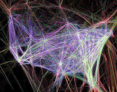
Finally, is an image of the flight paths of all the planes that fly over the United States, Mexico, and Canada in just one 24 hour cycle.
 |
| http://consci.s3.amazonaws.com//wp-content/uploads/usa-flightpaths750.jpg |
This image courtesy of Contrail Science which studies contrails and chemtrails that are emitted from aircraft and other machinery. In this constantly growing world that we live in, people are traveling more and more not just from country to country, but within the same nation as well. There is no better example of this then the United States, where thousands of flights light up this map with their flight path. More streaks of color or brighter amounts of it in an area indicate another flight that went through that area. The East Coast of the Untied State is the most busy, with Atlanta, Georgia being the busiest airport in America. This map helps remind us how much we take flight for granted. Just 100 years ago it was a novelty for only the brave or rich, now it is an extremely practice of all people that happens daily. Also, we often worry a great deal about the risks of flying as a public, but considering how many flights occur each day and how few have problems, it really is an incredibly safe although expensive way to travel.
All three of these maps portray an extremely interesting and dynamic view of the world regarding products, the climate, and practices that define this planet.
No comments:
Post a Comment